
Designing virtual queues that don’t feel like waiting
Virtual queues can make self-service smoother—or more frustrating. In this guide, we break down what makes the difference, and how to design queues that actually work.

📝 This article was originally published on the QueueworX blog
We all know how frustrating it can be to wait in line, whether it is at a bank, a store, or even when navigating a digital service portal. In an era where time is a precious commodity, virtual queuing has emerged as a game-changer for self-service portals, allowing us to streamline operations, enhance customer experiences, and reduce physical congestion.
These platforms (also known as virtual waiting rooms) empower users to find information, complete tasks, and resolve issues independently, offering convenience and efficiency. Alongside this shift, virtual queuing has emerged as a popular strategy for managing customer flow in various industries. Initially prevalent in physical spaces and call centers, virtual queuing is now increasingly being integrated into self-service portals, offering structured access to high-demand services.
But not all virtual queues are created equal. When implemented well, they reduce frustration, prevent system overload, and improve user satisfaction. When done poorly, they feel confusing, rigid, or worse—completely broken.
Unlike our previous posts focused on why users abandon digital queues or how to choose the right virtual waiting room, this article explores how to design virtual queuing systems inside self-service portals that work at scale—and feel seamless to the user.
The promise—and pressure—of virtual queues
Virtual queuing refers to digital systems that enable users to join a queue remotely, often through mobile apps, websites, or integrated platforms, rather than waiting in person. For self-service portals—online interfaces where customers can handle tasks like booking appointments, checking account status, or troubleshooting issues—this technology acts as a bridge between traditional service models and modern convenience. Imagine you are managing a busy healthcare clinic: instead of patients crowding the waiting room, they can join a virtual queue from their smartphones, receiving real-time updates on their position. This not only minimizes wait times but also frees up resources for more personalized interactions.
Virtual queues have come a long way from their early days in call centers and event ticketing. Today, they are woven into the core of digital portals in sectors like healthcare, banking, government services, and logistics. This broad adoption is justified by the fact that they promote fairness, lessen friction, and balance demand.
There is a catch, though: poorly executed virtual queues turn into yet another barrier. The problem is behavioral in nature rather than merely technical. In order for these systems to work, they should be designed not just for load balancing, but for perception and trust.
A smooth virtual queue doesn’t just hold a place in line. It communicates. It adapts. It reassures.
What the best systems have in common
The strongest virtual queues share one thing: they don’t feel like waiting. They feel like progress.
Behind that illusion of smoothness are a few key ingredients—each designed to give users a sense of clarity, control, and movement
🚨 Set expectations early—and keep updating them
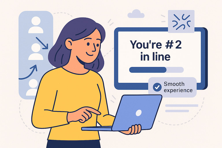
Nobody minds waiting if they know what to expect. The best systems show estimated wait times or live position in line right from the start.
Delta Airlines does this particularly well in their Sky Club lounges, where travelers join via SMS and receive live updates on their place in line—letting them relax or work while they wait. Whether it’s 2 minutes or 20, clarity is what matters.
🎛️ Make room for real life
People multitask. They switch devices. They get distracted. Good virtual queues acknowledge that by letting users pause, switch tabs, or rejoin the queue without losing their place.
U-Haul, a moving truck, and self-storage rental company, turned this insight into a competitive advantage by offering callback options instead of long phone holds—cutting dropped calls and improving satisfaction. Self-service means letting users stay in control, even if they step away.
😎 Speak the same visual language
The queue should blend seamlessly with your platform, not feel like an add-on. It should have a consistent design whether users access it via a portal, chatbot, or mobile app.
Retailers like Walmart and Target integrate queuing tools for fitting rooms or curbside pickup directly into their mobile apps—keeping users oriented and confident from start to finish. A consistent interface—visually and functionally—reduces cognitive load. Personalized messages (like using the user’s name or showing their service context) make the system feel smarter and more human.
🛃 Recognize that not all waits are created equal
Some tasks are urgent. Some users are high priority. Smart queues triage—routing users based on service type, complexity, or time sensitivity.
ModernMD, a healthcare provider, prioritizes patients by severity, allowing someone with chest pain to go ahead of someone needing a flu test. This approach is not only fair but essential. Personalization is not only about quick service; it also focuses on making the experience meaningful.
🔉 Keep the conversation going
A quiet queue is a brittle queue. Great systems provide small nudges—“You are now #3 in line” or “We are getting things ready for you.”
Even simple feedback reduces abandonment. Just like the best physical queues—think of how Disney keeps people engaged with music, movement, and storytelling—digital queues can do the same with timely, human messages.
Research from McKinsey, Gartner, and Forrester all point to the same truth:
People tolerate delays—but not uncertainty.
When interfaces are confusing, updates are missing, or queues feel disconnected from the platform, trust collapses—and so does conversion.
Finally, virtual queues should not operate in isolation. They need to connect with your CRM, scheduling tools, messaging systems, or EHR. Seamless backend integration is what enables a smooth frontend experience.
Where virtual queues fall apart
While virtual queuing holds immense potential, we have all experienced bad queues. The kind that leave you staring at a spinning icon, unsure if anything is happening. Or worse—being kicked out midway through a form submission.
When implementing this technology for your self-service portals, it is crucial to be aware of the frequent pitfalls that can undermine its effectiveness. These issues typically arise from neglecting user requirements, encountering technical constraints, or inadequate planning.
💥 Inadequate scalability
You might launch a virtual queue system that works flawlessly for a small user base, only to see it crumble under high demand. This was evident in early implementations by some ride-sharing services, where users reported being stuck in endless virtual queues due to server overloads.
🤐 Lack of lack of transparency and communication
A user clicks “Join the queue” and sees… nothing. Systems that fail to provide accurate notifications or reasons for delays can result in abandoned queues and negative reviews.
In healthcare portals, for instance, patients have complained about virtual scheduling systems that don’t account for no-shows or last-minute changes, leaving others waiting indefinitely.
Experts from Deloitte warn that without clear communication, customer satisfaction can drop by as much as 50%, turning a promising tool into a source of dissatisfaction.
🤯 Confusion and over-complication
If your self-service portal burdens users with too many options or requires excessive personal information to join a queue, you are setting yourself up for failure. This often happens when businesses prioritize data collection over user experience, leading to privacy concerns and dropout rates.
A case in point is some government service portals that attempted virtual queuing during the pandemic; overly complex interfaces deterred users, exacerbating wait times rather than alleviating them.
The key here is balance: while data is valuable, forcing users through unnecessary hoops can make the system feel intrusive and inefficient.
♿ Neglecting accessibility
Neglecting accessibility can exclude a significant portion of your audience. If your virtual queuing system isn’t optimized for diverse needs—such as voice commands for the visually impaired or multilingual support—you risk alienating users. In a global marketplace, this oversight can be costly, as it not only violates inclusivity standards but also limits adoption.
Reports from the World Wide Web Consortium highlight that inaccessible digital services can lead to up to 20% lower engagement, emphasizing the need for universal design principles.
These issues are not due to technical shortcomings; rather, they stem from design flaws. Such flaws undermine the trust that virtual queues are intended to establish.
Behind the scenes: design choices that make the difference
So what separates the good from the bad? Often, it is not just what the user sees—but how the system thinks.
A well-designed system involves a strategic blend of innovation and user-focused design. It understands:
🛎️ User urgency
Someone reporting fraud should be prioritized over someone checking a balance.
🛤️ Service type
A simple renewal doesn’t need the same path as a new registration.
📟 Device and channel
Users should be able to join from mobile, desktop, SMS—or switch between them without losing their place.
And critically, a smart queue communicates constantly. Updates don’t have to be flashy. A simple “You’re #3 in line—estimated wait: 4 minutes” works wonders.
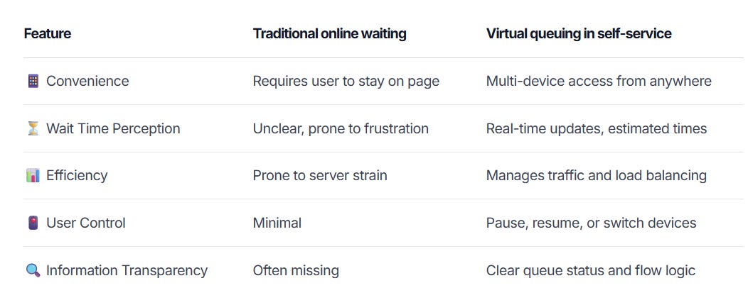
From theory to practice: a comparison table
To summarize what we have seen across different sectors, the table below compares traditional online waiting to modern virtual queues.
It goes beyond simply getting people through. It concerns their feelings during the waiting period.
What users actually want
Research shows that users are willing to wait—when the experience makes sense. Forrester, McKinsey, and others all point to the same core insight:
People tolerate delays. They abandon confusion.
In summary, the most successful systems:
Respect time and attention
Let users know where they stand
Adapt to different scenarios (e.g., first-time user vs returning client)
If you treat every queue as a passive holding pen, you are missing the point. A queue is part of the experience. It should feel like progress—not purgatory.
Final thought: don’t just build a queue. Build confidence.
Former Google executive Eric Schmidt once said:
The best technology is invisible; it empowers you without getting in your way,
underscroring the essence of effective virtual queuing: it should enhance your experience subtly, without overwhelming you with complexity.
Virtual queuing can greatly improve self-service by providing convenience, flexibility, and clarity. It can reduce user frustration associated with waiting, improve efficiency, and empower users with greater control over their interactions. However, they will only work if we stop thinking of them as background tech and start treating them as frontline UX.
That means:
Designing transitions, not just tickets
Prioritizing clarity over cleverness
Testing failure modes, not just happy paths
When users feel informed, empowered, and respected—they stay. They complete. They trust.
Done right, a virtual queue isn’t a delay. It’s a promise.
🔍 Want more? Explore:
How to fix frustrating digital queues (before users leave)
Learn why users abandon online purchases, and how to stop it from happening.
How to choose the right virtual waiting room
Virtual queues do more than throttle traffic.